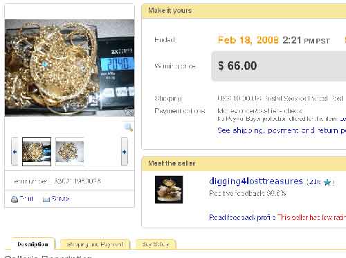
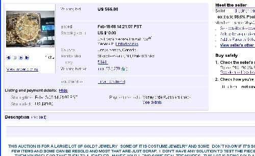
eBay periodically tests new designs and options throughout the site, sometimes in their sandbox and other times live. A user in the forums found a radically different listing design while surfing today. Above is a shrunk down image. You can see the full listing here. If the link is dead, I have a full size image here. You can see what the listing looks like with the current design here (or again, full size image here).
The price, pictures and seller are more prominent in the new design. Shipping info, payment options and buying tips have been put into a tabbed format along with the seller’s description (choose the tab to see the appropriate information). Previously, all this information is in a linear format going down the page.
The biggest change is just below the seller’s name. In red font, it says, “This seller has low ratings for Shipping Time.” There is no explanation behind this statement. The seller’s DSR for shipping time is 4.0 on a 5.0 scale.
If eBay is going to start pointing out possible problems with a seller, they should offer more information. Has the seller received multiple low marks in shipping time this month? Is a 4.0 considered a low score in shipping time? Without an explanation, any possible buyer is only left with an ambiguous, but dire, warning from eBay. If the point is to get buyers to make more informed decisions about their trading partners, give them more information.
Beyond that, I understand what eBay is trying to do with making certain elements pop out more (like the pictures). In this experimental design though, I find it all rather distracting. That could just be because I’m so used to the current design. There are several pieces of information missing, such as high bidder ID and item location. I would say those are two pieces of information that should stay visible.
There could be several new listing designs floating around right now, randomly being applied to a small number of listings to test them. I wouldn’t expect this to be the final version of any new format. If you want to give eBay feedback on the design, there is a link on the auction page to do just that.
Tags: changes · eBay · experiment · listing designNo Comments - Create a string


0 responses so far ↓
There are no comments yet...Create a string by filling out the form.